Networked Urbanism
design thinking initiatives for a better urban life
apps awareness bahrain bike climate culture Death design digital donations economy education energy extreme Extreme climate funerals georeference GSD Harvard interaction Krystelle mapping market middle east mobility Network networkedurbanism nurra nurraempathy placemaking Public public space resources Responsivedesign social social market Space time time management ucjc visitor void waste water Ziyi
energy
The carbon counters (in both physical and digital form) are meant to stimulate discussion about carbon emissions and climate change at the school of design. The impact that our buildings have on the environment is an issue that is often glossed over at the school of design as it is in most public discussions. If we want to address our concerns for the environment, issues of climate change need to be brought into our collective consciousness and that starts with raising awareness about own carbon footprint.
Climate change is an issue of global concern, with deep roots connected to everything from aging infrastructures to shortsighted policies and regulations. However climate change is also largely the result of behaviors caused by a lack of awareness about the impact our actions have on the environment. Every time we use our computers, turn on the air conditioning, or take a shower, we are releasing carbon into the atmosphere and contributing (in a small but nonetheless significant way) to global climate change. As a result of this general unawareness, people leave their lights on during the day, turn the air conditioning on high in the summer, and take hot showers longer than necessary – exacerbating the problem of global warming.
This semester began with an assumption that educating the public about the way our built environment works, specifically the way our built environment uses energy and contributes to the problem of global warming, has the potential to correct some of our more problematic behaviors. One component of education is finding ways to visualize the invisible yet ubiquitous energy infrastructure and how that infrastructure operates. The other is to visualize the real-time impact our buildings have on the environment, and in so doing affect the decisions we make regarding how we interact with the built world.
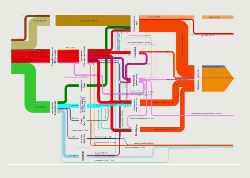
While there are undoubtedly many ways to communicate this information, the studio was an opportunity to experiment with an unfamiliar medium: animation. The first experiment involved an animation describing the movement of energy from the point of resource extraction to the point of consumption (the city of Boston). Since Boston, like many northeastern cities, creates most of its useable energy from burning natural gas, the animation begins in the Mississippi Delta where most of the nation’s natural gas is processed before it travels via one of several large pipelines to the electric generation facility. The fact that Boston relies heavily on natural gas for its electric generation is an important point because it enables one to calculate the amount of carbon created per kilowatt-hour of electricity generated.
This first animation was an introduction to new tools, and new techniques of representation. While it was an informative exercise, it failed to communicate the urgency of reducing our collective energy footprint. The description of resource movement from source to sink was ultimately too abstract and removed from the everyday behaviors of ordinary citizens. Using the lessons learned from this first iteration, the second animation used data collected from actual buildings to concretize what was formerly too abstract.
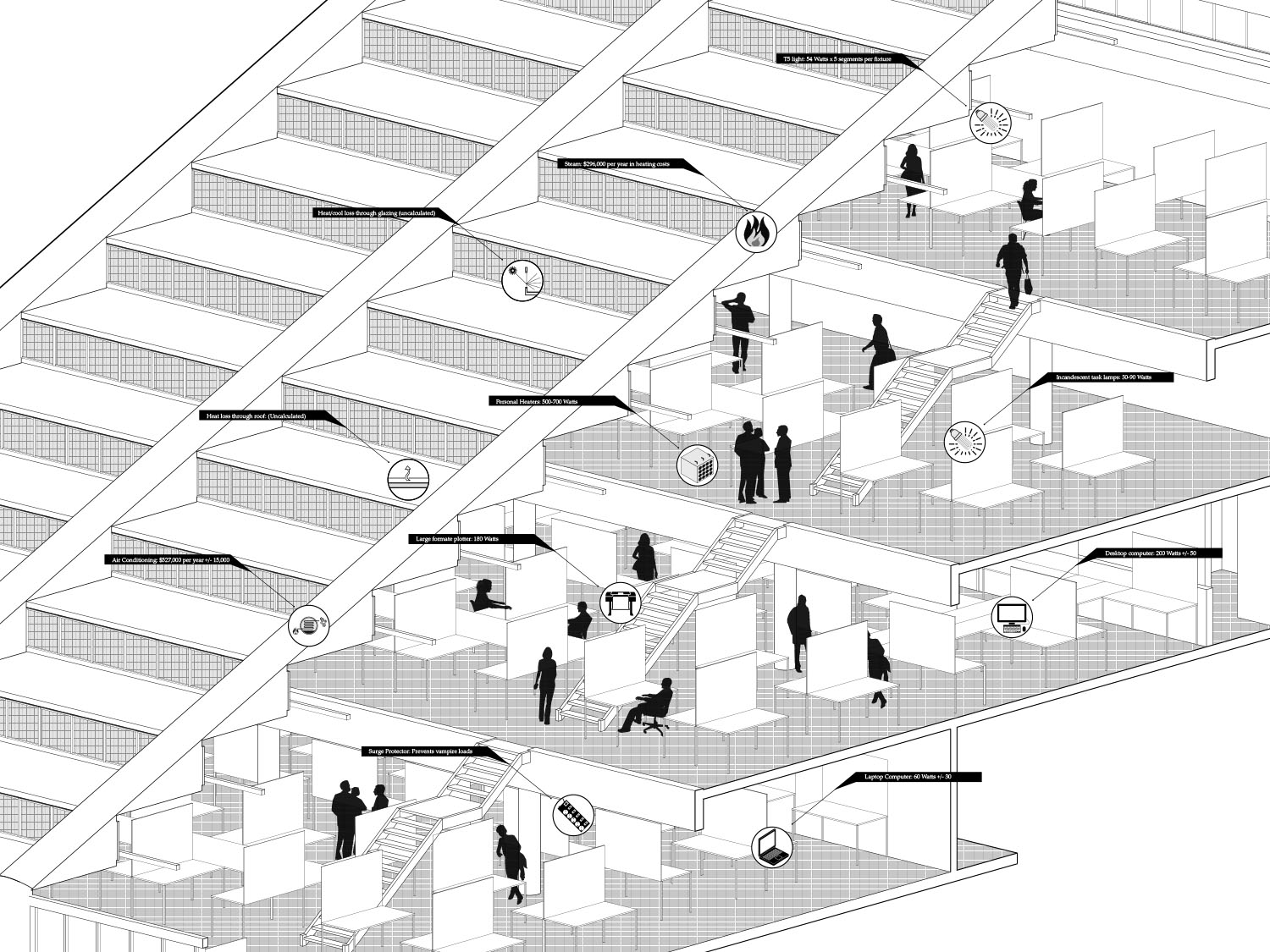
Even with the complexities involved in the processes of energy generation and transmission (deregulated markets, interconnected power grids…etc.) collecting and animating information about how specific buildings or groups of individuals use energy is decidedly more difficult. In order to streamline the research, Gund Hall served as a test kitchen because of their psuedo open data portal to energy monitoring systems. Real-time data on everything from lighting loads to steam use is continuously collected, packaged, and then emailed as a text file once per day. Using this information, the numbers in the animation are presented in traditional terms, such as a Kilowatt-Hours for electricity used for lighting and therms for heating, as well as comparative figures such as number of houses powered per year. For example, the amount of energy used to light Gund Hall is equal to the amount of energy it would take to power 208 medium sized houses. The numbers and figures are also presented in relation to other buildings on the Harvard campus as a way to accentuate the point that Gund uses more energy per square foot than almost any other building in the area except the Science Center (and most of this energy goes toward unnecessarily lighting the building during all hours of the day).
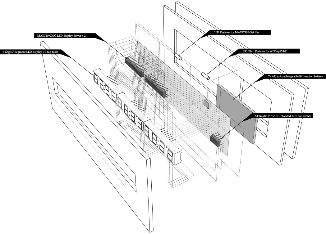
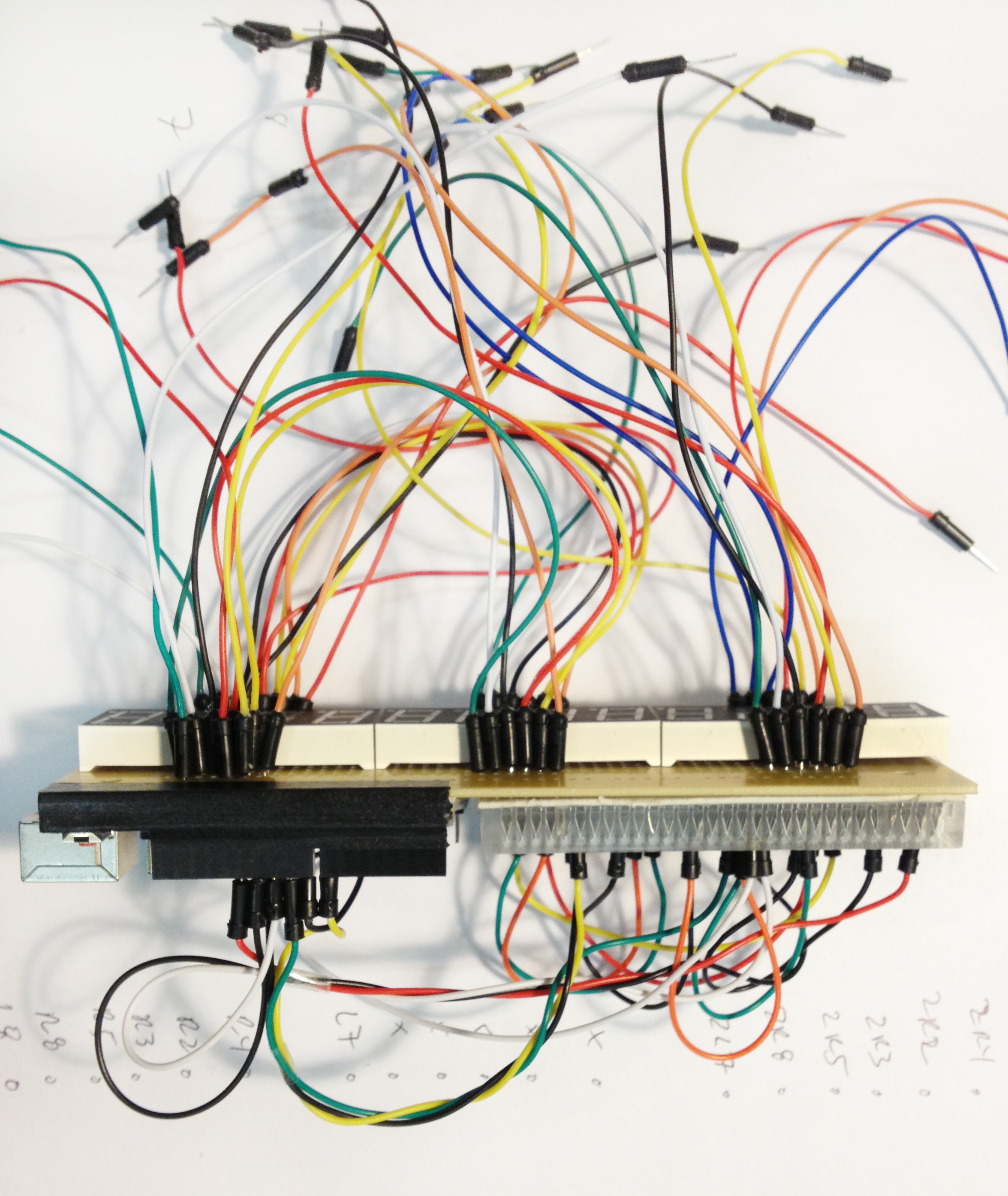
This animation played in the Chauhaus alongside a device that reads the (almost) real-time carbon emissions of Gund Hall. Although the output from this carbon counter is a simple number, the device was designed as an object of intrigue that people could walk up to and investigate – a dynamic and slightly more interactive type of informative poster.
These types of displays are particularly important for the design school, since we as designers are rarely confronted with the reality of how our creations impact the environment. Buildings account for almost half of all carbon emissions in the United States, and designers have a responsibility to create an efficient and responsible built environment. If an awareness of energy use becomes part of our consciousness as designers, and if we are constantly reminded of the ways in which our creations use energy, we are more likely to design and create a better built environment for the future.
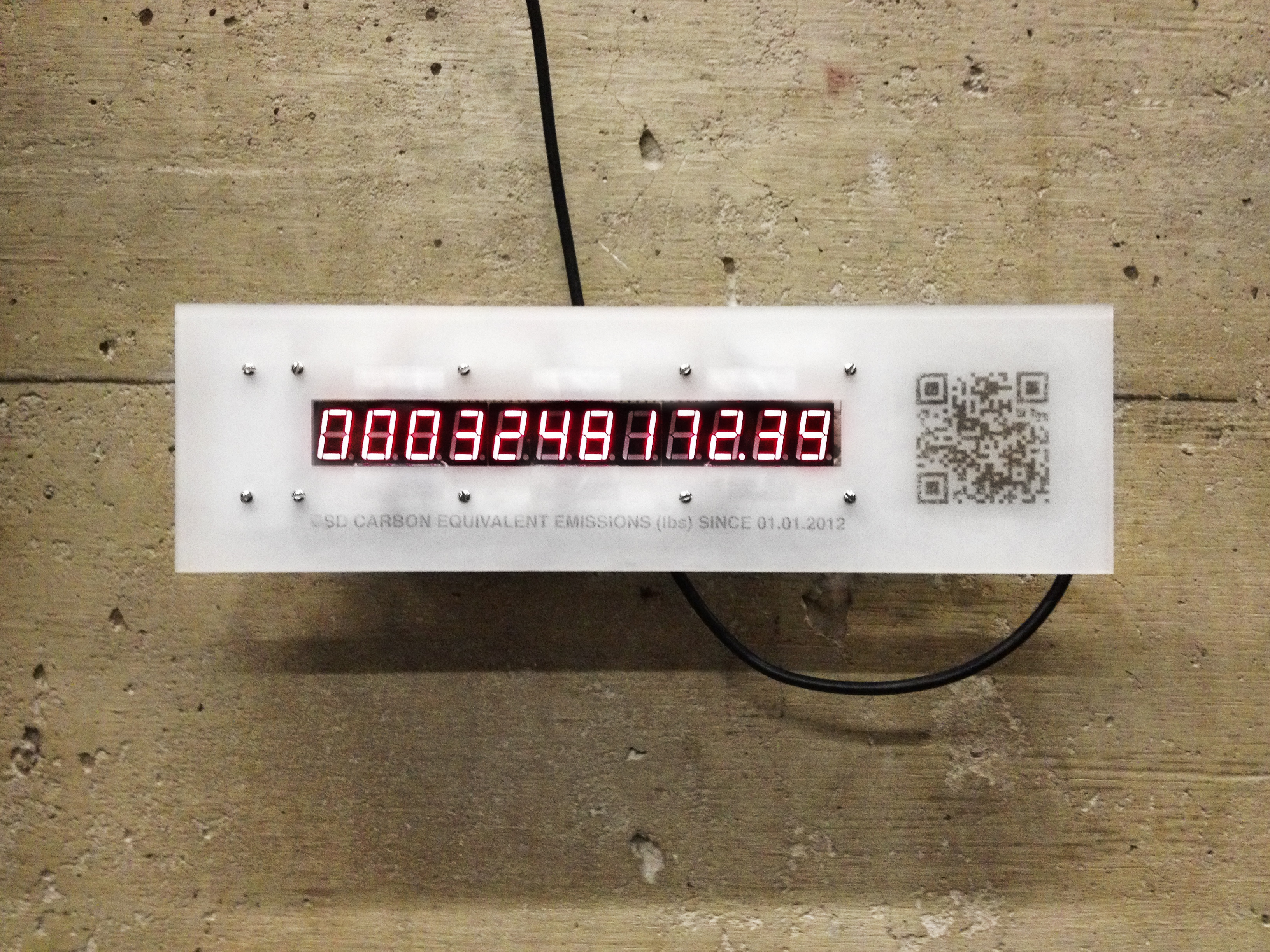
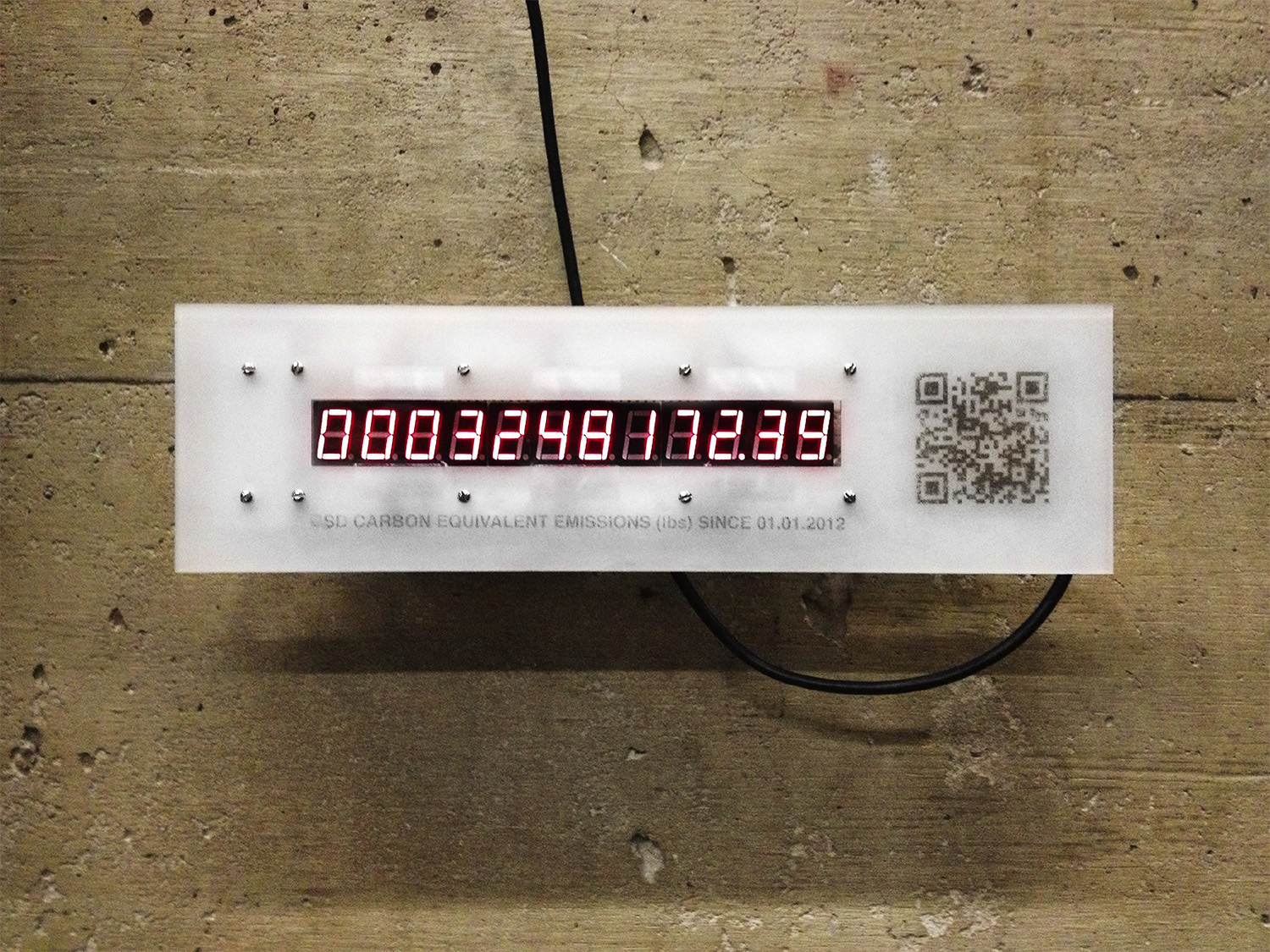
The biggest challenge to reducing our collective energy footprint is visualizing what is normally unseen and forgotten, namely the energy we use everyday. Of course, even if our energy use is rendered as a number, or a graphic, it’s a bit too abstract to actually change our behavior. My initial experiments with this idea led to the development of the carbon counter that is currently displaying the carbon output of the GSD in the Chauhaus. The idea was that people would come up to this object of intrigue, snap a picture of the QR code, and be led to the Architecture 2030 Challenge website (which challenges architects and urban designers to realize net zero projects by t he year 2030). Not surprisingly, this device is pretty hard to miss, so I’m currently trying to think of an installation that will attract more attention to the actual flows of energy at the GSD. The installation is going to be coupled with a brief animation that describes all the ways that the GSD is using energy, and how to improve our collective performance.
Currently, I’m working on the back end of the system to get energy information in real time from individual plug loads. I received a plug monitor that runs the open-source protocol Zigbee that will interface with an Xbee adapter that I already have hooked up to an Arduino. The challenge now is to make the two devices communicate with each other, and then design a system that will turn this information into a visual and physical spectacle.
Unfortunately, I’ve spent the last week out of the country so progress has been slow. However, I’ve managed to narrow down my research interest toward exploring ways to visualize and understand urban energy flows in and around Boston. At my desk-crit before I left, we discussed possibly creating a video or other type of visualization as part of an educational curriculum about energy conservation. Since the first step toward attacking an issue such as energy conservation is understanding the problem, I think a type of “Public Service Announcement” that makes people aware of how energy is distributed throughout Boston is a good start.
Toward this end, I’ve managed to arrange a couple of meetings this week with the office of sustainability at Harvard to get a grasp on how the university’s grid interfaces with NSTAR and other regional energy providers. They may also have some good ideas about how to kick-start initiatives aimed at conservation in an educational setting. I’d also like to talk to people at the School of Education at Harvard, and at some public schools in the area (one of my professors suggested I contact the people at the Cambridge mayor’s office for this) about what initiatives exist in terms of sustainability in the classroom.
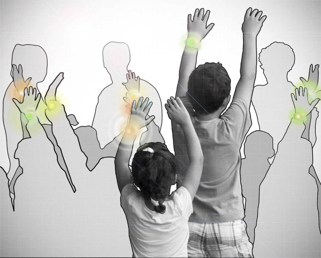
On a somewhat related note, this was a quick concept collage that I came up with before I took off – the idea would be that kids could participate compete in program to monitor their energy use at home as part of a more comprehensive curriculum. I haven’t totally abandoned this idea, and I think I could roll it in with my other ideas to create a more holistic approach to this idea of understanding urban energy flows.
I’m proposing to link the idea of understanding energy infrastructures with public education. I think there is a way to encourage sustainable behavior insofar as it relates to energy conservation by engaging a network of young students in Boston. The first step is to visualize the vast amount of information that exists about our energy infrastructure, and then create a system whereby students can interact with that infrastructure via a web or mobile interface to a social network. Without going into too much detail, I think it’s possible to combine educational programs with incentives to conserve and/or responsibly use energy (in all its forms). I am really inspired by the Natural Fuse project by Usman Haque, and I’m wondering how that system might be scaled up.
Think Big:
How can we encourage people to understand, appreciate, and sustain our urban energy infrastructure. Is it possible to develop a system that teaches people to conserve energy, on a scale large enough to make a significant contribution to offsetting our collective carbon footprint?
Start Small:
The first step is simply to understand how energy is created, distributed, and consumed in the city of Boston. In order to approach the complexity of the energy infrastructure that exists in this city, I propose to develop an energy monitoring and visualization system for a select number of households, to get a sense of how a typical Bostonian uses energy in real-time. The next step is to connect this system to social networking sites (Facebook/Twitter) and open the platform up to students in the area. The ultimate goal is to incentivize energy conservation by engaging a large network of students who can keep each other accountable in terms of their energy use.
Act Now:
Currently refining the ideas of the proposal, and trying to think how this system might be different from energy conservation programs that have failed in the past. What would be the most effective way to visualize the information at hand, and how will I engage the community to garner interest in the project?
Now I don’t speak spanish, but the website from this video has some great information on open-source information sharing, and envisions how it will eventually be integrated into everyday life. In any case, the video is wonderfully mesmerizing.
From the exhibition here last year. One of the more impressive examples of using a building with a live performance. At one point they are actually projecting live images of the dancers onto the facade.
This post is mostly for @andrewpleonard, but the idea of creating critical mass is universally applicable I think. I stumbled upon this video while trying to look for examples of why bicycle culture has evolved so far in places like Denmark and the Netherlands but remains stunted in the U.S.
The video is from the sometimes hilarious Copenhagen Cycle Chic website: http://www.copenhagencyclechic.com/
This seems like a great website – a collection of emerging ideas about how personal metrics can change our behavior. The creator describes it as a site devoted to understanding “how we can change our lifestyles through monitoring, measuring, and deriving meaning about our behavior.”
http://www.personalmetrics.us/
Although a bit scary, check out the Basis Wristband – monitors your health, interprets the data, and then makes suggestions about how you might improve your lifestyle:
http://www.personalmetrics.us/2011/09/basis-the-story-of-your-health/